Primary philosophy:
1. Crouch: People who want to jump must crouch themselves first. (Underneath, for Shinya Kimura)
2. Curve: Music should be elegant like curves, light like in floating in the sky. (Above, for Antonio Stradvivari)
Thus:
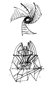
I designed a rocky space for Shinya which is narrow and limiting. But once he drive the motorcycle onto the display level, he'll be free to ride.
I designed a floating and curvy space for Antonio. It has great play of light, which is just as playful as music characters. It's semi-open studio designing is for him to show off his just-finished violin.
The open space on the ground is defined as the display area. It is wide and plain.
Out of the wooden brace is for Shinya, he needs vast place to ride.
Inside the circle is for Antonio. There is a great space for people to relax, sit down, look up, admire the great piece of architecture and the great sound coming from studio.
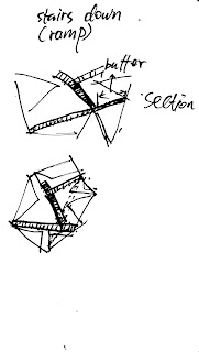
PS: 2nd and 3rd pictures are actually taken in wide angle, whose perspective is thus different.
PPS: I'll try to find a great stair as well as great interior space for Antonio soon.
Question:
Do you think the display area is unfinished? Or it's just fine?
(A little defence for myself: I believe masterpieces should not be like goods, being priced, laid in raw and be picked or even bargained. They need to be shown to public and then understood, respected and admired. Buyers should wait for the masterpiece. Once the masterpiece is released, it must be traded instantly. Thus, there is no need for a display "room". Just a show area is fine.
Besides, I'm quite afraid that the extra room on the ground level will break the interaction between upper and lower studio.)
00002.tif)
00004.tif)
00001.tif)
00003.tif)